
My point of view on seasonal colour analysis
Do you know the seasonal color analysis?
It consists of linking a woman to a seasonal color palette based on her own colored features such as the skin, the eyes, and the hair.
Spoiler: I do not use it and will tell you how I do instead.
I/ How does seasonal color analysis works?
- Seasonal color analysis theory
In short: there are two seasons with cold color palettes (summer and winter) and two seasons with warm color palettes (spring and autum). Then two “light” seasons (spring and summer) and two “dark” seasons (autumn and winter).
You then are supposed to determine whether your own colored features are warm or cold and light or dark and pick the season and its color palette accordingly.
- Examples
Light and golden skin and hair? Spring gal like Blake Lively or Amy Adams
Light and cold skin and hair? Summer beauty like the Fanning sisters or Rihanna
Light to dark golden complexion with medium to dark warm hair? Autumn lady like Beyonce, Julia Roberts or Adele
Cold dark hair and cold skin : winter princess like Anne Hattaway or Lupita Nyong’o
- Limits
Originally conceptualized by Carol Jackson in 1980, the color theory applied to white women only… so the current theory is a stretch that, IMO, leaves many people in the autumnal season.
This leads to the current evolution of the theory that divides each season into more subtle categories.
When you have soft contrasted features like Adele, you would be “muted autumn”, when you have dark contrasted features like Julia Roberts you would be “dark autumn” and when you have very warm features like Jennifer Lopez you would be “warm autumn”… all having their accordingly matching palette.
… which starts to sound a bit complicated doesn’t it?
II/ Does it work?
=> Yes it does
Since the palettes has the same characteristics than your own skin and hair colors, it is most likely to match them in a harmonious manner.
=> No it does not
It is too narrow: there are more colors a person can wear than those in her palette
It is complicated to apply in everyday life.
It is difficult to put each unique individual in a box.
III/ Why I do not use the seasonal color analysis
=> It is too specific
The shade are TOO subtle
Consequently
- It can be tricky to find the very shades in your palette in the shops
- Human eyes is not that subtle. No one will be able to tell if this shade of light blue suits you best than the next one.
=> it doesn’t take our personality into account
- What if you have a sweet color palette but your soul is dark?
- There is no need to look ” the most radiant” everyday
- You can play outside of your palette to contrast with what mother nature gave you
=> I think the four season method can be a good starter to give you an intuition of the colors that flatter your skintone the most (whether warm, cold, dark or light)
But then do not take it for an almighty rule and enjoy getting dressed!
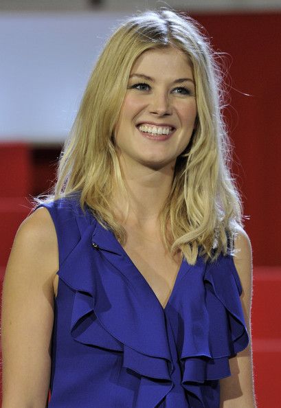
=> Example
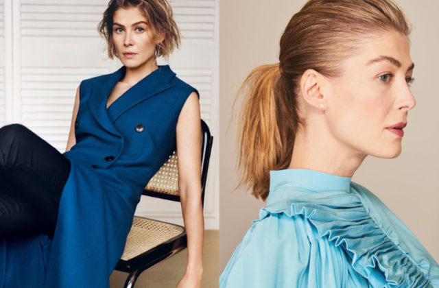
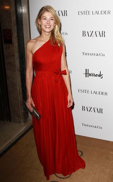
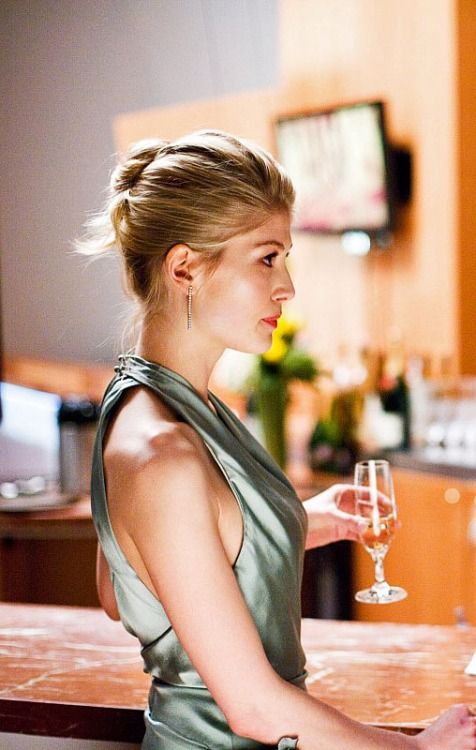
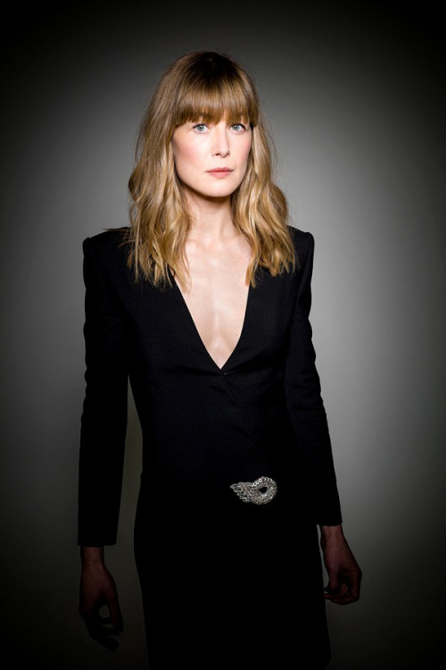
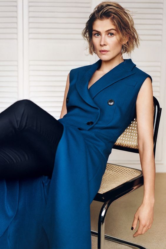
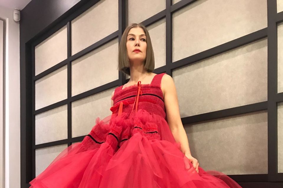
I show you with Rosamund Pike
Light golden skin and hair, she looks like a spring woman.
Therefore the warm and light shade shall look darling on her… and they do
With this glowing baby blue
Soft camel
Creamy yellow
Warm and bright red
And this sage green than some would maybe say is SUMMER but I don’t care it LOOKS NICE
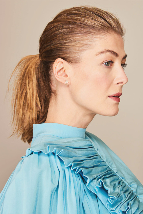
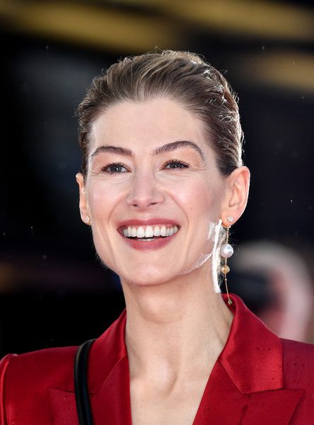
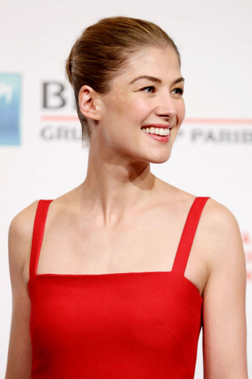
Yet she also look gorgeous in black (not in her palette). Are we going to take away the power of an edgy black dress from all spring and summer women? No we are not because they look fab in them.
She looks also fab in this blue even if it most likely doesn’t belong to a spring palette.
As well as in this icy pale color harmony.

And then let’s not forget about the hair color change that play a role.
She also looks stunning in this pinkish red dress and ashy brown hair.
In short you do not HAVE to look the same all the time.
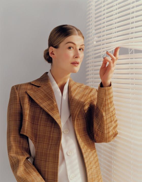
What is sure though is that there are colors that definitely are not flattering for her and those are the only ones she shall really avoid.
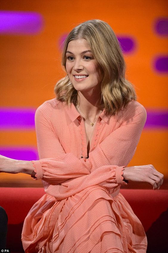
She looks a bit cold in this dark red, but also that’s a vibe
Yet let’s acknowledge she looks better with a warm and lighter one
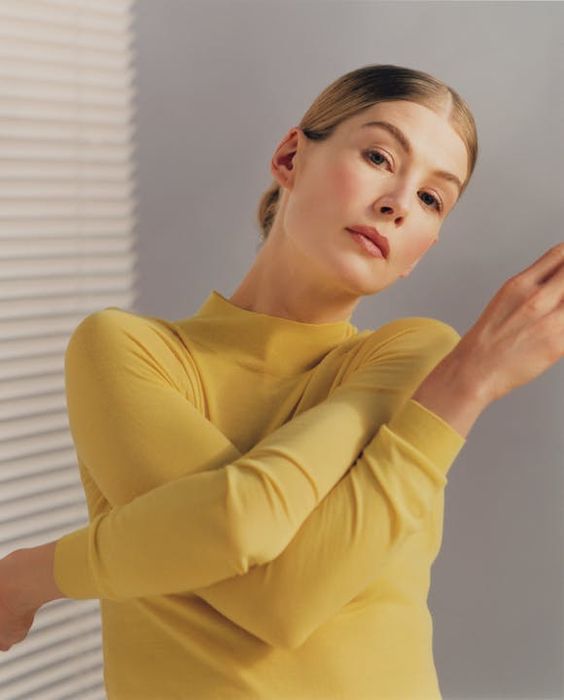
Also not into this peachy pink although that’s a typical spring shade (warm and light). It’s so close to her own coloring that she looks off.
And then THE dreaded colors.
Like this horrible horrible electric blue that was all the rage in the late 2000’s and that is so saturated it really steals the show from blue or green eyes.
IV/ My color analysis method
Before starting the color analysis, I get to know my client. What she usually wears, what she likes, dislikes… but also whether she likes to be noticed or not, if she is the shy or the bold type… and the many subtleties of each individual.
That allows me to feel what I call her “vibe” .
It’s a very intuitive process.
Then I apply this vibe to the colors that are flattering to her skin, hair, and eyes.
I give easy to understand general inspirations to keep my client’s options open.
First the neutral palette
And then the colors she can incorporate and how (a lot, a little, combining colors or not?).
I describe the color in terms of warmth, depth, and intensity when needed.
I can tell a client that “dark sultry colors” suit her … which is generic enough to let her plenty of choice in the shops.
And I can tell this same client to keep away from muted, washed-out and greyish colors.
In the portfolio, I illustrate all those tips with women that have similar colors and vibes to those of my client.
=> how do I know if a color suits someone?
As I said, it’s quite an intuitive process, and trying to break it down would lead to a mess of a theory like the seasonal color analysis one.
I do not have rules that apply to all human beings. I sure tend to recommend warm tones to the warm-toned women, and cool tones to the cool-toned women. But I don’t make anything a dogma carved in marble.
Also, the less saturated the colors, the less important their warmth (or lack of) is (you can’t really tell the difference between warm and cold colors when they are dark or light).
My goal is to tailor you an easy-to-apply color analysis guideline.
Ask me for your style portfolio including your color analysis!
V/ Colors only affect your face if they are close to it.
Don’t overthink whether your pants or shoes are in your face color palette. It doesn’t matter.
The “good looks” shades are most important worn next to the face. So try wearing hats, scarfs, tops or earrings that flatter you if you want a feel-good effect.
And remember, there are no eyebags a well-chosen lipstick can’t fix.
VI/ Colorful style icon wear a wide range of shades
Stylish women know what flatters them… and they know a lot of colors do!
Watch those Instagram stars wear all kind of colorful shades:
And you? What’s your opinion of the seasonal color analysis?
I have tried for years to figure out my “season”. The closest I could come is soft summer or soft autumn. But I am a white woman, born with very very light blonde hair, medium dark skin and very very dark brown eyes. Later my hair turned mousy brown and now it’s kind of a champagne grey ( not silver grey). That doesn’t seem to fit any “season.” Summer has light eyes and winter can’t be blonde. I look good in olive green and black, but mostly muted dark cool colors. Those combinations don’t seem to belong to any one season. And you’re right about the subtle colors. Who can find such subtlety when you’re shopping?
Merci beaucoup pour cette lecture très instructive!! Les explications sont très claires et j’apprécie le fait que la théorie peut devoir être adaptée selon les personnes.
Avec mes yeux noisette (mélange de vert et brun, avec une pointe de rouille), mon teint très pâle et jaunâtre (qui bronze pourtant facilement et intensément, et qui devient orangé foncé) et mes cheveux blonds dorés vraiment très pâles durant l’enfance, mais ensuite bruns bien ordinaires, virant tranquillement au gris au fil du temps, j’ai toujours pensé que j’étais AUTOMNE.
Mais j’ai l’air tellement malade dans les tons de beige!!! Me serais-je trompée de saison? Normalement, ça devrait aller, non? Les femmes AUTOMNE rayonnent dans ces teintes…
Les pastels froids me vident de mon sang, tout comme le gris pâle. Le bleu pétrole me va, tout comme le rouge tomate.
En prenant pour acquis que mon teint est chaud, ce dont je ne doute nullement, alors j’ai les options PRINTEMPS ou AUTOMNE. Mais avec les cheveux qui grisonnent, sur un fond brun très neutre, c’est très embêtant… Surtout si on observe que les différentes tonalités de beige me sont difficiles à porter, à part peut-être ceux très très clairs. Ouf, le Camel est terrible…
Si jamais vous êtes inspirée par ce défi, je prends tous les bons commentaires. Merci beaucoup!
Je viens de tomber sur cet article fort intéressant, je pense être comme vous, en principe :automne même profond !!! teint çhaud, yeux marron foncé
et châtain foncé àvant, mais laissant. mes cheveux grisonnants naturellement, je suis incapable de tŕier correctement ma garde robe… je dirige mes achats vers les couleurs froides et vives qui me
vont mieux eþavec le teint bronzé en été et pâle l’hiver, c’est l’horreur ,je suis aussi les vidéos YouTube d’Emma d’endive ( anti- colorimétrie) bonne journée
I actually think Rosamund Pike is a light summer, which is a cool-neutral season. They can wear a broader range of hues than true summers, can go slightly brighter, and are still on the cool, light side primarily – which would make sense of most of the paradoxes you noticed when assuming she’s a spring 🙂
I was fascinated by colour analysis in the 1980s, as I had so little confidence in dressing myself then. I had a mother who was blonde and beautiful, but looked like my father, dark eyes and hair, with my mothers pale skin. I was also tall with curly hair. I longed to be average height, with swishy blonde hair and blue eyes and wear pretty colours like pale blues and pinks, and flowery, floaty dresses that did not suit me at all. In the 1990s I found, quite by accident, that the clothes and colours of the decade suited me. Black looked great on me, the minimal black pants, the tailored trouser suit, the pencil skirts cut to knee length, the white blouse, and I felt great! After that, confusion in the early 2000s as fashions changed and became colourful and eclectic again. So, I went for colour counselling and discovered I was a dark autumn, the only type of autumn to be able to wear black. Yes, I was warm, which is why the “white” blouses I had worn were usually in fact ivory toned, not pure white, I had discovered myself in the 1990s. A consultant in a shop had previously decided I was a winter, as I looked so good in black. Yes, I did take on board some of the dark autumn colours, the deep, dark greens, as my eyes were dark olive green, almost black, but to be honest, the dark browns, rusts and mustards felt too warm for me, so I lived still through to a few years ago in black, olive green, ivory and a bit of dark red. The problems arose again when I started to go grey, after a few years the dark dye felt too dark and hard and I started to go slightly lighter, mid golden brown, as I didn’twant to go grey. I saw another colour counsellor, who thought I should go much lighter and more gold coloured in my hair, which I felt looked too hot in the face and my husband really disliked! I bought a lot of mustard shades for my warm and light new colour group of warm autumn, but never felt right in them. My two favourite items of clothing remained my Armani black coat, bought in the sale, but worn almost every day, simple, sleek and timeless, and a long jersey, black and red print stretchy straight skirt that could be dressed up or down, jeans or black trousers and white tee shirts, plus a few olive green jackets and navy linen palazzo pants. In theory, these clothes aare not right for me, but I end up giving everything else to charity as I don’t feel right in them or wear them. I recently went to a new hairdresser, who has done hair and makeup for celebs and TV and she was not impressed with the hair colour, which she described as “too light and faded looking on me, and too, too warm”! Despite me being in my sixties, she has dyed me a very slightly warm mid shade, which is actually darker and cooler than before and not the one the colour counsellor advised. Everyone I meet asks if I have had some expensive beauty treatment as they say I look ten years younger, so for the moment, I am sticking with it! All this various history has made me doubt whether colour advise is too simplistic for many. I feel best in simple shapes and colours. As I have an hourglass shape body, something I used to be embarressed about, as I didn’t want to wear fifties, flirty type of clothing, I was also advised to wear, I prefer slightly fitted, tailored lines that fit the body well, but are not too girly. This too is against the advice, but what I feel best in. To sum up, yes I think it helps to know if you are warm or cool, but wearing only mustard and browns when slightly warm felt wrong and too hot. I do not feel the out and out rules need to be stuck too and not all of us fit into it perfectly or feel right in certain formulas, we are far too individual for that.
Loved your article and what I can tell about the photos is that she def looks best in cool colors.
Cardinal red (the first red dress!) is a universal go for all the 4 seasons.
I was just typed as a summer and was very upset about the black – but I also felt that black was a universal – what I discovered (only when actually draped!) was- I looked so much better is this super deep – almost black shade of grape. So I think it would be the tone of black – so for a Summer a purplely shade of black is a clear winner over “just black” probably the same w/ every season.
But you’re so right when you say the colors that WOW you – are at times impossible to find in the shops!!!! SO frustrating. I serious hated most of my palette but did try an experiment- wearing those shades… COMPLIMENTS ALL AROUND. Which was good – but also bad – LOL now I think I need to settle into those colors.
The palette is actually huge and if ur not feeling it- then you don’t need to use those WOW colors- theres plenty of others with in your palette. Although i would encourage ppl to do a test and see what feedback you get.
I realized that the cool colors are like color correctors in makeup on your face. I’m a cool undertone – but my skin LOOKS warm (yellow). Wearing cool colors make my skin look more ivory/bright.
I do agree- I’m more of an edgy biker style so the Summer palette is still something i’m working on….
It is a myth that everyone can wear cardinal red. I was typed an Autumn long ago. There are three colors that make me look really sick: cardinal red, grey, and pale yellow.
Hello Aloïs !
J’adore ton blog que je lis depuis des années, je trouve tes articles vraiment utiles !
Pourrais-tu stp faire un article sur “Comment être originale au bureau tout en restant professionnelle” ou quelque chose comme ça ? J’ai toujours envie d’exprimer ma personnalité au travail, mais je ne sais pas toujours ce que je peux me permettre ou quels détails donneront la mauvaise impression
Merci d’avance !! et continue ton super travail
Bonjour! Merci beaucoup pour ton message 🙂 C’est un excellent sujet je prends note!
Et ravie de te compter parmi mes lectrices <3
Hello Alois
What a fabulous article, thanks so much! I have read every article on your blog for years now (can’t remember how many), and I particularly love the pictures that you use to illustrate.
Mostly I am a silent internet lurker, not a commenter, one of your stats, really, but I had to comment today, because I am by profession and training a Personal Colour Analyst, based in Hobart Tasmania.
I am so glad to read such an intelligent write up on colour analysis, a lot of the articles on the internet are a bit brief and recommend such incomplete advice as ‘Red heads should wear blue and green to compliment their hair colour.’
I thought I might quickly add my top colour tips, some of which will agree with yours and some will elaborate my point of view and where it may differ.
My history with colour analysis goes back nearly 20 years to when I was in my mid twenties and I read the original book by Carole Jackson Colour me Beautiful, and I was so confused. I did not seem to fit any of the archetypes described in the book. I was not an autumn, of that I was sure, I didn’t think I was a winter but otherwise, ? So I found a colour consultant and got draped. I was BLOWN AWAY. My mother had bought most of my teenage clothes and she had different colouring to me, and then in my 20s I bought what was cheap (it was the 90s, so black mostly!) And I always had this blue grey not very nice undertone to my skin. Well, in light spring colours I didn’t, light warm colours were great.
What I learnt that day and since is that
1. good colour analysis is about what matches the skin tone, and I am not talking surface melanin. I am talking about carotene, haemoglobin etc.
So I have had blonde dark autumns (they had a very saturated skin tone, that’s what needed all that deep colour) and blonde soft autumns, very dark eastern European bright springs etc etc. The original type casting style of colour analysis was very Caucasian in focus, but when you focus on colours that suit the skin tone you get some ladies of African descent looking fabulous in apricot, or violet etc etc and drab in bottle green for example. So, I have found that good colour analysis is trans – ethnicity.
2. The palette or swatch that you receive is not the bible, it is a guideline to your MOST flattering colours. And it helps your colour memory which is generally about 20 seconds.
a. Not all your best colours are on there. You use the swatch when shopping to see what colours ‘belong with’ or ‘tone well with’ your swatch. For example if your palette is full of warm muted colours then a very saturated electric blue may not tone well with either it or you and you should try it on with that awareness.
b. When you were draped your analyst was seeing what your predominant colour attributes were – eg, warm, cool, dark, light, clear, soft. Some people will really only have one – ie they can wear anything as long as it is warm , or cool, or bright, or dark or light etc. Other people will have two attributes that are important for them. I for example look best in things that are light and warm. But I know that I can also wear things that are warm, mid way between light and dark, but not totally bright. So I wear warm browns well, but very bright warm red can be too much colour and overwhelm my fairly colourless complexion (that’s why I am light). So, more than what is on the palette, if you wear colours that reflect the same colour properties that were found to be important to you, then the colour will flatter you.
c. Not everything you may want to wear will be on your palette. It is often a choice between being flattered by the colours that we are wearing, or doing some other cool thing with our outfit. Wearing an outfit in flattering colours is not the only valid outfit choice (of course) we may want to wear something in black, the fashion perennial colour, or in this season’s fashion colour. We may want to make a political or social statement, or copy a cool outfit we saw etc etc. All of these can make great outfits, but they will not flatter the skin as much as a choice in a really flattering colour. That is neither good nor bad, it just is the case.
3. Some people look great in a broad spectrum of colour and some In a smaller one.
4. Make up needs to adhere to the colours that flatter you to really work. If you know that cools or brights don’t work, for example, it will look better if you steer away from them.
5. Good make up can make us look good even when our outfit colours don’t.
6. The eye can tell the difference between a flattering and unflattering colour on people, even if the colours themselves are fairly close together. This is obvious between warm and cool close colours in particularly, such as a warm purple and a cool royal purple or a cool baby blue and a warm light warm aqua, but as you said, it is important to get the warm and cool right, so this is no surprise. But I have also seen people come to grief on colours that are close when one is clearer and the iother more muted, I am thinking of certain apricots here , but generally you are right, people will look good in all the dark bright cool greens etc, rather than good in just one dark cool green.
7. You mentioned personality being important in colour analysis and I think this is the key. Some people love to know exactly what suits them and then want to wear just that. They prioritise ‘flattery’ over other possible outfit goals. Precise colour analysis makes them feel confident and in control. Other people are going to play colour flattery off against other criterion as they build their outfits and wardrobes, and pick what is important to them. And knowing what is flattering is not meant to restrict us, it is knowledge that we will use how ever we want to.
And, in conclusion, I still wear black. (But it is about the only unflattering colour that I still regularly wear) because black is so chic and great for evening wear. But I make sure my make up is in my right colours.
Dear Katie,
Thanks for sharing your experience! I agree with you that the palette is an instrument and not the bible 🙂
Bonjour Aloïs,
Article très intéressant comme toujours. Je crois comme vous qu’une très grande partie du rendu des couleurs dépends de la matière: belle matière = belle couleur, mais… pas forcément seyante.
Pour l’anecdote, l’un de mes cousins était prêtre, comme il est très grand, il lui était difficile de pouvoir emprunter des vêtements liturgiques donc pour son ordination nous nous sommes cotisés pour lui offrir une « garde-robe » à sa taille. Ca coûte un rein… Et il faut des chasubles dont les couleurs correspondent aux temps liturgiques: blanche, rouge, violette (ou mauve), jaune, verte, bleue. Que des couleurs saturées. Et évidemment il n’est pas question de colorimétrie, pareil pour tous quel que soit la couleur de peau. Chose surprenante, au final çà passe très bien. Je ne me l’explique pas. Maintenant ce cousin est devenu moine: robe de bure et sandales, dépouillement ultime.
Lors de son ordination, il avait un « confrère » africain. Toutes les femmes de sa famille s’étaient achetées le même wax et chacune avait cousu sa propre tenue. Le résultat était réellement magnifique.
Merci d’avoir partagé cette super anecdote!
Toujours très inspirant.
Merci
🙂
Super intéressant (comme d’hab’), j’aime beaucoup ton approche de la mode 🙂
Je suis un deep/dark winter selon la colorimétrie (cheveux très bruns/noirs + peau très très pâle -je ne sais pas trop si les sous-tons sont chauds ou froids par contre), et ça tombe bien car mes goûts de meuf sombre et mystérieuse (j’y crois) tendent vers les couleurs conseillées (je porte du noir quoi).
Au final je trouve surtout utile de savoir ce qui ne va *vraiment* pas au teint parce que ça peut plomber une tenue qui pourrait être vachement sympa (j’ai retrouvé des photos où je portais de l’écru avec du marron et c’était… pas terrible).
Par contre, marrant, ma mère m’a toujours dit que le kaki était parfait pour les brunes à la peau très pâle, je ne la voyais pas comme dangereuse du coup !
Et haha, les photos de Rosamund Pike en bleu roi, ça fait extrêmement fin des années 2000 oui ! Donc en toute logique on devrait retrouver ça d’ici 8/9 ans ?
De toute façon c’est comme tout le reste des “règles de la mode” la colorimétrie, autant piocher ce qui nous arrange et laisser de côté ce qui nous gonfle, dans le piiire des cas on a une tenue pas parfaite, ce qui n’est pas la fin du monde (et quand la personne kiffe ce qu’elle porte c’est largement compensé par l’attitude).
Comme on ne peut pas faire de règles il se peut que certains kakis aillent aux brunes à la peau pâle (je dirais ceux qui ne sont pas trop désaturés) mais d’expérience ce n’est pas la meilleure idée pour la plupart d’entre elles.
Surtout qu’à part si la couleur nous fait VRAIMENT une mine affreuse (ce qui est rare) personne ne va rien remarquer.
I was wondering why I never read any of this in your books… and otherwise I see it lately in every social media. And this method makes me feel a bit uncomfortable to be honest, because it kind of makes me think that I have to look for certain colors ALL THE TIME. I though, how is this possible? How can Alois let this happen?. So I am quite happy to read that this is in no way a rule. I am brunette and Hispanic so I was like: I don’t want to end up with a closet full of terracota shade clothes… I love crispy blues and to wear silver sometimes. Your articles come always in the right time. ❤️
This is so helpful to hear, especially the bit about the human eye not being quite that subtly attuned. I had my colors done by a tetrachromat (he sees incredible variation of color) – and got a palette like you described – which induced quite a bit of stress initially. I’ve played with it and realized that, while the guidelines are correct, I love clothes and ALL the colors far too much to be limited like that. And you – thank you – have convinced me that I still can wear black – so YAY!!!
Yay to black!
Seasonal color analysis is a very helpful tool however the difficulties of finding the “right shade/color” are very real.
I agree with all the things you described in today blog entry – especially about the “Human eyes is not that subtle. No one will be able to tell if this shade of light blue suits you best than the next one” – lol.
The other blogger mentioned that most celebrity photos are enhanced and don’t give the clear picture of true skin tone or hair color making the assessment of the person’ season very difficult.
Still – I like to use my fav colors as much as possible while shopping 🙂 .
Indeed, the seasonal color analysis does work and have fun using your colors while shopping 🙂
I actually use some of its principles (which simple color matching principles).
Personally, I can’t help but be attracted to colors that are not my personal best but just feel amazing… and I still get compliments haha 🙂 As long as one doesn’t go totally wrong…
Merci pour ce chouette article Aloïs ! Quand j’avais 15 ans, j’étais blonde. Mon entourage m’avait martelé que le jaune n’allait pas aux blondes, Quand une cousine m’a passé un ensemble short jaune soleil et que j’ai rayonné dedans pendant bien des étés, j’ai compris que c’était plus amusant d’aller vers ce que j’aimais plutôt que de me conformer à des principes restrictifs.
Maintenant j’ai les cheveux gris. Le jaune est une couleur que j’affectionne, je la porte souvent en hiver. Ça booste le moral.
Là où je vous trouve très forte c’est quand vous m’avez montré que le rose pâle et les couleurs fanées près de mon visage c’était pas la joie…
Et heu… j’ai un haut col roulé en laine bleu roi, il me va super bien. Je mets mes bo en bois cognac avec, c’est super.
…
J’ose pas vous dire que mon maillot de bain est bleu vif aussi
Mais oui le jaune va aux blondes! Bon selon la théorie des saisons certains jaunes vont à certaines blondes. Mais selon moi on peut dire que généralement le jaune va aux blondes. On reste dans un camaïeu avec les cheveux!
Le rosé et les couleurs grisées font typiquement partie des couleurs “dangereuses” qui desservent pas mal de personnes. Et c’était en effet le cas pour vous.
Le bleu roi tempéré par la chaleur du cognac ça doit être canon sur vous en effet! Je trouve que cette teinte passe avec les cheveux gris et les yeux bleus comme vous. Et aussi quand elle n’est pas en méchant polyester. Nan mais j’ai une dent contre elle haha.
Je citerai aussi une amie très brune à la peau super pâle à carnation froide et aux yeux bleus éclatant qui peut la porter.