Why I don’t believe in the three colors rule
Popular opinion has a lot to say about fashion.
“Red does not suit blondes”, “do not mix black and navy blue together”, “gold and silver don’t match”, and, above all “DO NOT WEAT MORE THAN THREE COLORS IN AN OUTFIT”.
“Otherwise you’ll look like a clown or a parrot” (ooouuh frightening).
“You talkin’ to me?”
Julia Richter by A personal style
“Erm, no madame, you look très chic with all that colors on you!”
So proof that more than three colors in an outfit CAN look amazing, right?
Even though Julia Richter clearly is talented at color matching, she is helped by her clever choice of color shades.
Instead going for bright colors, she preferred subtle hue.
Because indeed, more than three bright colors together can be overwhelming.
So before we start, here are examples of what I think you should avoid
– Have a look at this young lady who is pushing a bit too much with primary colors (yellow + green + red!)… That bright green next to that bright yellow… Not very subtle, isn’t it? I wan’t you also to focus on the two additional colors that come from the blue jean and from the black bag. Instead of making the outfit looking more colorful, they make it look LESS colorful because they are not as bright.
– This went heavy handed on the flashy colors. Pasture green + shocking pink = my eyes are crying. Here, the problem is the choice of the colors rather than their number.
– And even there where she managed a better color mix, I think the outfit puts too much bright colors at once (brigh red + mustard yellow + pale blue… But again, the problem is the choice and the width of the color surface rather than their number. I think that without the pale blue, the outfit would be even more overwhelming. And that if she used a bright bleu, it would have been worth.
Conclusion: yes, you can wear more than three colors in an outfit as long as you choose them wisely
And here is how.
1. Temper the bright colors in both quantity and number.
Three is a good maximum number for bright colors in an outfit.
Prefer to wear little flashes of bright colors rather than big color blocks next to each other.
– one bright green vest + one bright yellow blouse + one red skirt = hello Harlequin even though you DID respect the “rule”
However
– one bright green bag + bright yellow shoes + bright red lipstick and nailpolish + pale blue jean + a white blouse = classy! Even though your are actually wearing two more colors which makes five.
Fashion is not math.
2. Include some neutral colors into your mix
I call neutrals white, black, greys and also beige and navy blue cause they tend to match with every other color.
Mixing some into an outfit is a good method to wear lots of colors while staying elegant.
Furthermore, they make bright colors look chicer as we just saw in the introduction.
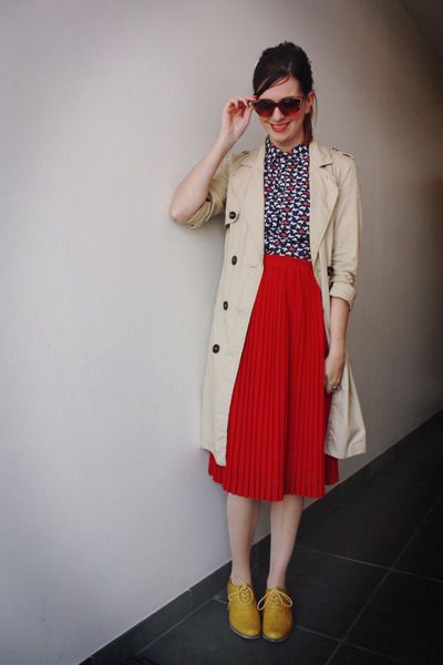
Red + yellow + beige + black and white print = 5 colors for a spruce look
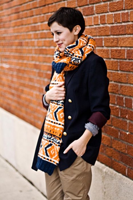
Orange + Cobalt blue+ purple + camel + navy blue + grey = 6 colors. But not over the top isn’t it?
3. Choose subtle colors
We noticed that bright colors worn with no subtleties can look rather tacky.
So if you want to wear lors of different colors, prefer subtle ones.
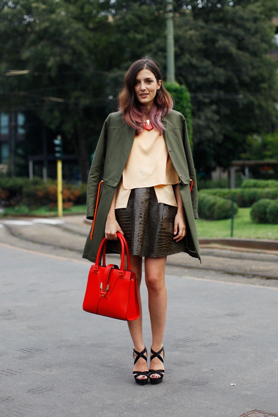
Eleonora Carisi is wearing kaki, a rather dark color, pastel yellow, a whitened color, brown, another dark color, black shoes, a neutral and a bright red bag, the only flashy item of her outfit. Color counter on 5.
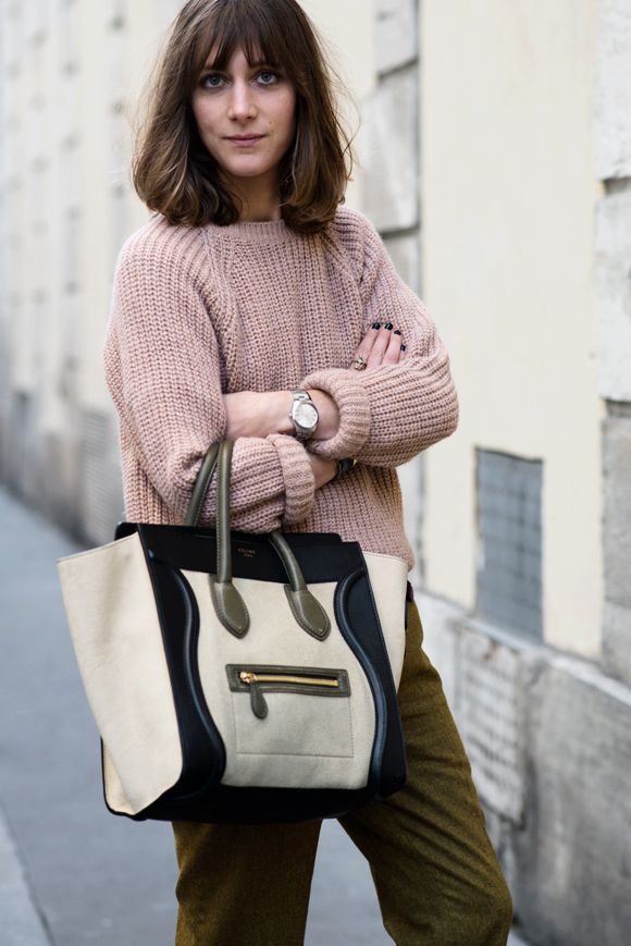
The locals spotted this well balanced color mix in Paris. Kaki pants with dusty rose + a bag featuring three neutral shades = 5 colors for a refined result.
How to recognize subtle colors? They are those that look different from the ones you find in the basic color wheel at school 🙂
They have been mixed, whitened or darkened.
4. Play on color saturation
In order to create harmonious outfit, it is interesting to temper bright colors with whitened or darkened hues.
In this way, a bright yellow will be softened by a pale blue or navy blue item but can look overloaded with a bright blue one.
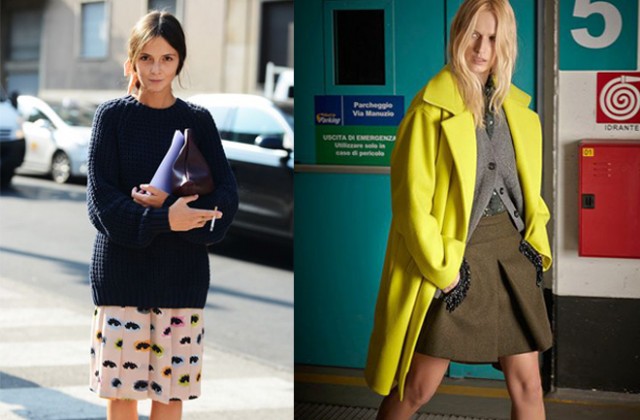
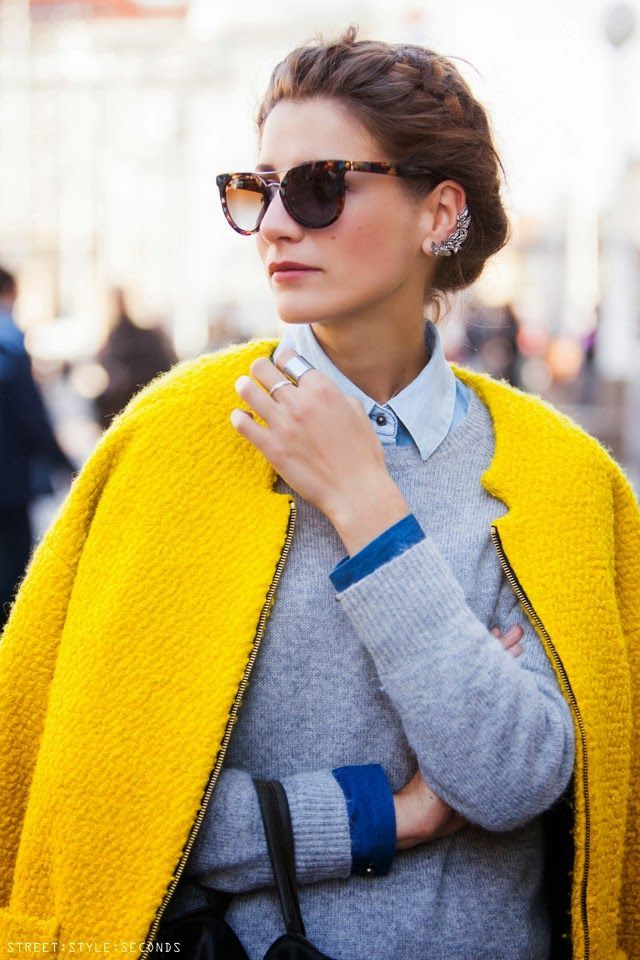
Here we see how she softens her bright yellow coat with lighter hues. Total count = 4 colors.
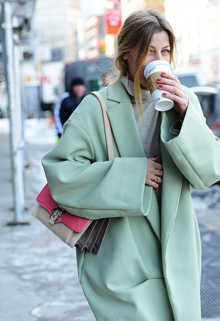
Almond green and candy pink complete perfectly. A bit of cream white and of pale grey match the harmony. Total: 4 colors.
An outfit with only pale colors or only dark colors can look great. That’s only the outfit made only with bright colors that I disaproove.
5. Think of using different hues of the same color
You can do it either:
– by mixing white or black into you basis color (pale blue, dark blue)
– by mixing other colors to your basis color (turquoise blue, lavender blue, etc.)
When worn together this colors are so close that it does not feel like wearing several colors.
And therefore it is a good way to pile lots of colors together.
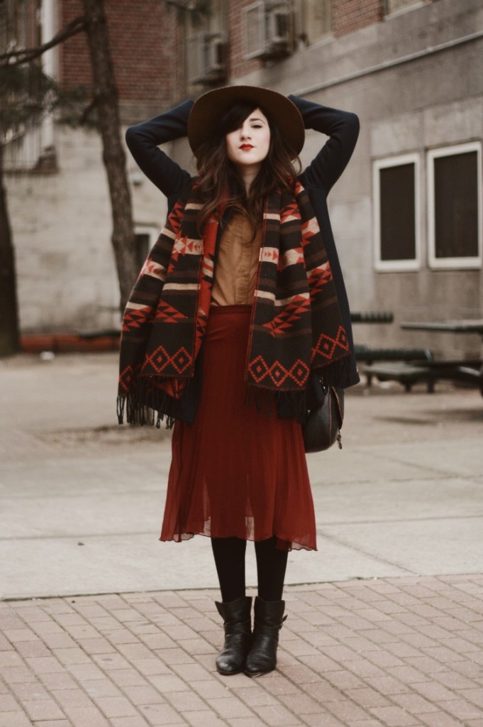
Flashes of style wears shades of brown and red.
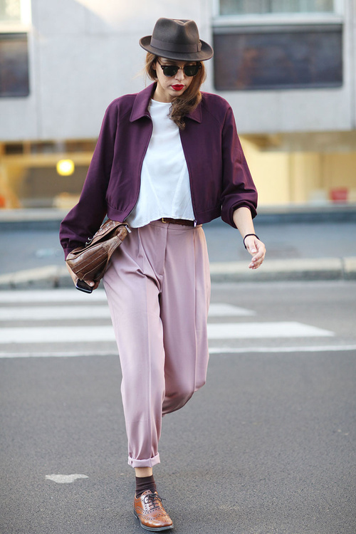
Lynchpinchofnonsense.Shades of purple + shades of brown + white = great mix of 5 colors.
Remember that, even with using shades you should remain subtle in order to be elegant (here she wears too much neon).
6. Prints are your friends
By the way, prints itself are proof that there is no such thing as a three color rules since lots of great prints feature more than that.
And do artists bother using such a rule when creating painting?
Using a print is a great way to create a multicolored outfit.
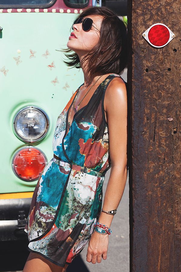
Only a dress will do it (worn by les babioles de Zoé)
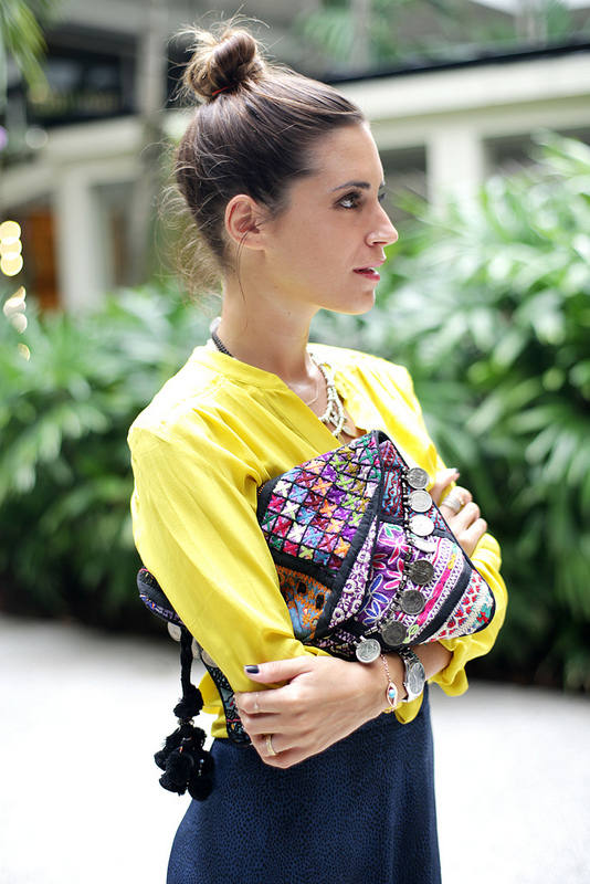
Or a great Antik Batik bag. (Gala Gonzales).
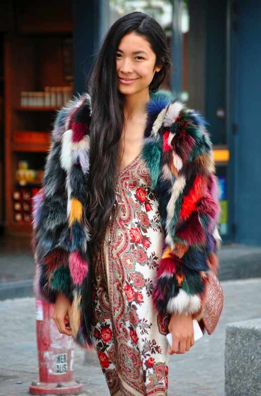
A daring print mix Valentine Gauthier.
Grand finale!
And you, do you follow the three colors rule or you do not bother?
Cover collage: Unknown, No 21
Snowhite wearing two shades of blue, a pale yellow skirt and hints of bright red.




Within the boundaries of a true summer palette, soft and subtle hues, I happily create outfits multi colored. Blues, purples and pinks along side neutrals are all best friends! Check me out on Instagram and blog fancified.ca
🙂
When I was younger, I was much more experimental with colour, somewhere along the way my wardrobe became “safe”. This post was inspiration to shake things up a bit. I came across this website, design-seeds.com
that puts together beatiful colour palettes pulled from beatiful images. I’ve been having fun seeing my clothes with a fresh perspective.
Great website !
Bonjour, j’apprécie votre blog. J’aurai une question sur les couleurs si vous le permettez.
J’ai une robe grise pour une soirée je souhaite l’associer à un sac rouge pour la couleur j’hésite pour la couleur des chaussures et des accessoires que me conseillez vous?
Vous pourriez choisir des chaussures noires ou nude dans une matière différente de votre sac (daim et cuir lisse par exemple, ou cuir mat et cuir brillant). Côté accessoires l’argent et l’or seraient très jolis. Mais un collier multicolore ou d’une autre couleur (bleu, jade, etc…) pourrait fonctionner. Faites des essais dans votre garde-robe!
Thanks, Aloïs, for your fashion blog. I am a woman with blue eyes, naturally rosy cheeks, and blue/green eyes; I break the three-color rule every day. White and navy are my neutrals. My “bright” colors are tints: mint, violet, watermelon, aqua, tangerine, lime, and the like. I live in a beach community, so I fit with my colorful surroundings.
🙂
Great Snow White reference! Let us not forget, the Evil Queen in that same story mixed black, white, gold, and two shades each of purple and red and looked FABULOUS. 🙂
I think by “subtle” colors you mean “subdued” or dark colors – not the neon or bright colors. This is helpful because I find myself sticking to black, white, and one additional shade, and have a hard time choosing subdued color clothing that would go together well.
Also, for some reason I am completely stymied by shades of brown. They all look like they clash to me, and I rarely buy brown because to me, the different shades of khaki, camel, and chocolate only seem like they go with their opposite shades of blue or purple, and not with each other!
Ahah, so true about the evil queen!
I meant subtle, as the colors that are not the basic or bright colors but that includes complex shades such as safran or antique pink as well as darker shades of course.
Shades of brown are not easy to wear indeed. I shall write an article on how to wear them.
I keep a limited colour palette in my wardrobe, practically everything works with everything else. I vary it slightly with the seasons and only use colours I absolutely adore, mixed with basic greys, khakis, black, demin. I keep pattern to scarves and one or two silk blouses. That’s because it’s easier that way.
That is a clever technic for those who like minimal color use 🙂 Can work in a great way!
Blanche-Neige, super cool illustration. Je poke Naomi, elle a intérêt à lire sa grande soeur !
<3
Great post about colour!
Merci
I’m thinking that the wearer’s personal colours also play a big role here. For example in the Valentine Gauthier photo the skirt is almost a neutral for her since her hair has a very similar colour. Same goes for browns and brunettes. If a woman has a lot of colour and contrast in her skin, hair and eye colours, she can wear more colours (that don’t clash with her) and still not look overwhelmed. I think that especially brunettes with very brights blue or green eyes can pull of even very crazy colour combos (think Michelle Trachtenberg).
What you say is true about the fact that the skirt in Valentine’s Gauthier picture almost match the model’s skintone, but I could picture a black girl or an asian girl wearing that combo too.
And I agree on the fact that brown is indeed a neutral for brown skin girls.
But I also think that every woman can wear the colors she wants and not feel too limited by her complexion 🙂
Bonjour
Je suis également intimement persuadée que toutes les couleurs peuvent aller a toutes les femmes que l on soit blondes, rousses, brunes mais aussi noires, blanches, asiatiques…..tout est une question selon moi de dosage et d’intensité des couleurs qui sieront mieux à certaines et moins à d’autres.
Je mets un point d’honneur a porter de la couleur en été mais aussi en automne /hiver que je tempère par du bleu marine ( c est pour moi le nouveau noir comme l ont décrit certains magazines de mode) et du gris dans toutes ces nuances( gris clair et /ou foncé avec du framboise ou du moutarde ….)
L ´été j’use et abuse du bleu Marine melange avec du beige, du moutarde et du blanc …ça donne une association très élégante. Bleu marine, turquoise et orange sont également un bon mix auquel je recours en été …
Tout reste effectivement une question de dosage subtile mais en lisant votre article je me suis rendue compte que je porte 4 couleurs de manière involontaire avec ma montre argentée et un bracelet (très fin ) en or ( ils sont toujours ensemble et situés sur le même poignet …je ne sais pas pourquoi, je les préfère du même côté ) et ça ne choque pas du tout.
J’utilise également deux couleurs de vernis très particuliers ( violet grenat et un gris très particuliers tous les 2 qui se mixent avec quelques tenues sans frôler l’aberration stylistique (Même si le gris en question est à manier avec plus de précautions…).
Merci pour cet article.
Bon dimanche
La couleur en hiver c’est tellement bon pour le moral 🙂
Bon dimanche aussi!
Hello Alois. I just found your blog and love it! I find your advice to be very helpful and have already received compliments from following some of your tips! I have a question about the neutral colors. You list black, white, gray, beige and navy as the neutrals. I recall reading where some have put colors such as brown, burgundy and olive in the neutral category too. What do you consider those colors to be? Is there a “secondary neutrals” category and how do you work with them? Or are they just other colors much like yellow, orange, green, etc? I hope my question makes sense! Thank you.
Hi Karen,
I think they are what I call subtle colors in the opposite of bright colors in the article. They are easier to match than bright colors but are not neutrals cause they contain colored pigments. Black white and grey do not contain any. Navy blue and beige have a tiny bit, I call them neutrals anyway.
But you cannot match burgundy and olive with everything I think. So no, not neutrals 🙂