How to “unmatch”?
After my “when is matchy too matchy” post, I promised to teach you how “unmatch”.
Like the unbirthday of Alice in Wonderland.
This technic can work for each and every piece of your outfit.
I showed several examples in my “how to match colors post“.
But as last time we focused on accessories and small pops of colors, I want to do the same focus on this post.
The old fashioned way to match details was to choose them in the same color: red bag, red shoes, red nails, red lips.
Nowadays, this is outdated and I explained you how to match things in a modern way in this former article.
But then, what should the color relation between you shoes and your bag be? Between your nails and your clutch? Between your top and your shoes? Etc…
The easy way out is to pick neutral colors such as black, beige, white, navy blue, and have only one pop of color (bag or shoes but not both). Easy and stylish.
But ladies, I am sure you read me because you are interested extra stylish is what you are aiming for.
Before we start, let me freshen up you color knowledges.
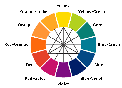
- Colors that are located opposite to each other are complementary (yellow and violet for instance). But you could also pick the color almost opposite and it’ll still look like a complementary color (green and violet, a classic). The great thing is that these colors complement each other making the other appear even more beautiful.
- Colors that are located next to each other are neighbors colors, they are helpful when you do not want to create too much contrast but want to avoid being matchy matchy. (For instance orange and red, green and yellow).
- Colors that are different shades of the same hue… I call them like this (like red, pink and burgundy)
Here are some style tricks you could use to coordinate the colors pops in your outfit.
1. Match complementary colors
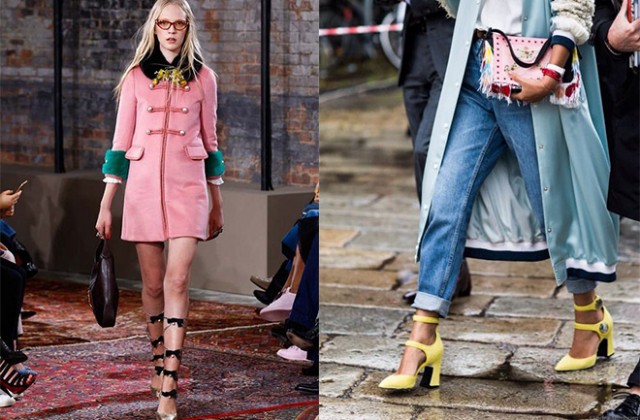
- Yellow coat and pink shoes
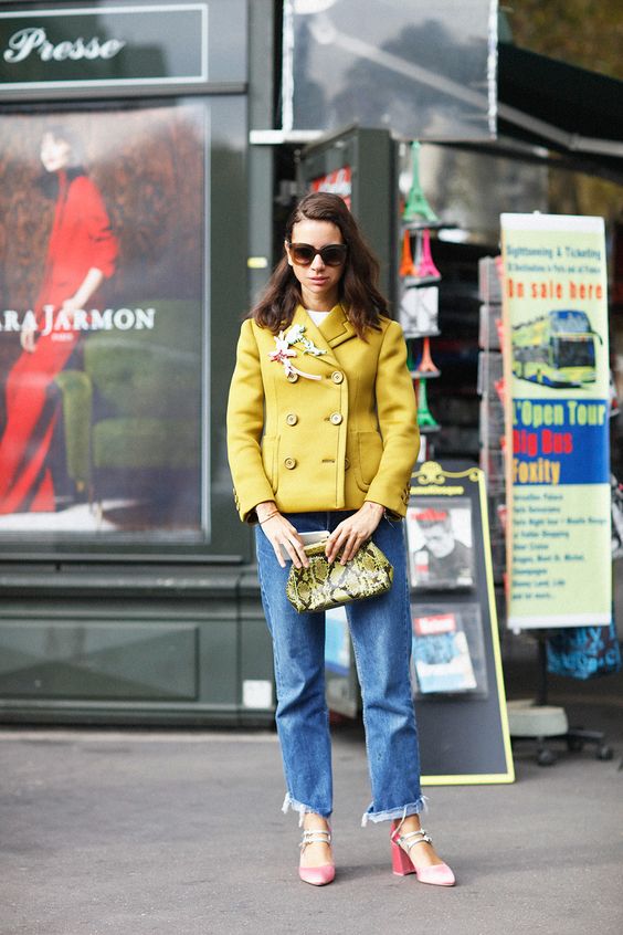
As you can see on the color wheel pink and yellow are almost complementary color. Fashion is not an exact science, so for the purpose of this topic, let’s say they are.
- Burgundy and navy blue
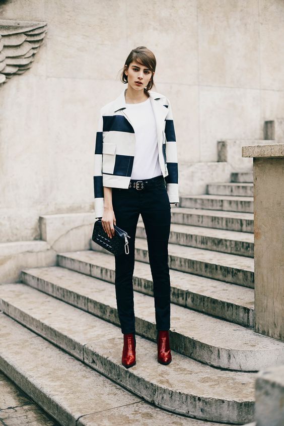
Sonia by Sonia Rykiel
Matching two complementary dark colors is easy and non risky.
- Fuchsia pink and forest green
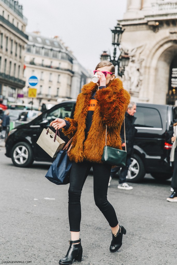
I am speaking glasses and bag here. Do not let the fluffy coat make you attention on what matters here ^^
- Navy blue and sunny yellow
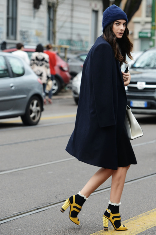
Matching a dark color (navy beanie) with its bright complementary (yellow sandals) is always a good idea
- Primary red and primary green
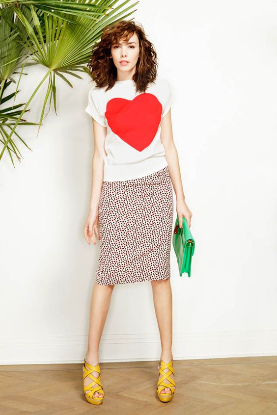
Essentiel
Could it BE more obvious ? (read this à la Chandler)
Also the shoes and the bag are a neighbor color (yellow/green) which leads us to… trick number 2 (what a transition master I am today).
2. Match neighbor colors
- Red and purple
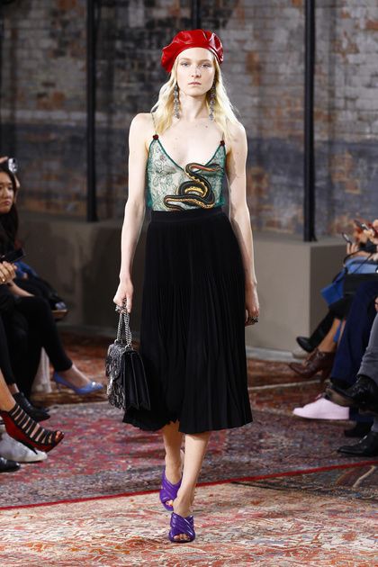
Gucci
- Mustard yellow and burgundy
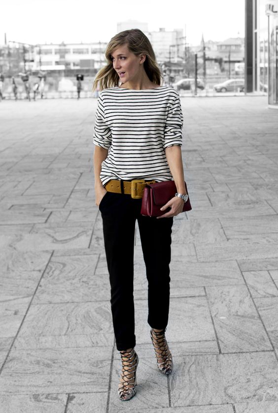
Unknown
3. Match different shades of the same color
- Burgundy and soft pink
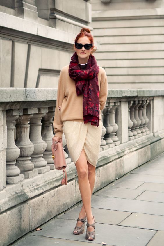
Taylor Tomasi by Citizen couture
Those who read my lookmakers may have noticed I use this trick a lot.
Do the same at home ^^
Browse your closet and get all of your accessories out. Then try to pair them with either a complementary colored accessory, a neighbor colored accessory or an accessory in a different shade of the same color.
Enjoy!
Cover collage: Gucci, Unknown



Just the article I was looking for!
I have many pale shirts in my closet such as powder blue, baby pink,off white etc. Tired of pairing them with Black and dark blue jeans. Could you suggest some outfit combinations of such pale shirts with gray/ cream trousers or jeans? I want to complete the look with silver/ gray/cream shoes and bags. How can I put the look together?
Génial ! Merci à vous.
J’ai acheté en solde des derbies moutarde et vernis, magnifiques bien sûr 😉 et j’étais en train de réfléchir à comment les porter, votre post arrive à point nommé !
Mais en fait, ne s’agit-il pas de “comment assortir les couleurs” ? Dans l’un de vos posts “pourquoi je ne crois pas à la règle des trois couleurs” (ce à quoi j’adhère à fond), vous présentez des associations tout à fait dans le même esprit. Et du coup je me dis “il y a un truc que t’as pas compris”, pourriez-vous m’éclairer 😉 ?
Ah ah, vous avez raison, je me répète pour que ça rentre.
Bon, la différence ici est que je me focalise sur la question des accessoires que l’on a tendance à utiliser en rappel de couleur.
Ah oui bien sûr !
J’étais partie sur les chaussures qui ne sont pas si accessoires finalement… 😉
Continuez à vous répéter, on adore !
I think something needs to be said for color, value (lightness or darkness), hue (intensity). In design school, I was taught you should change one or two of these. So if you have two contrasting colors, red and green, and you have the same value and hue for each, it can give you an eye sort. Instead, if you pick a lighter green and a very intense red, they will give you a “matched, but unmatched” atmosphere.
I agree with you Anita.
If the colors are far way enough and one at least is only applied on a small item, colors of the same value and intensity can work though.
This was so helpful! And you explained it perfectly. I’m off to my closest to do some experimenting and testing. Thanks so much!
xoxo
Autumn
http://www.itsautumn.com
Do a post about this and tell me when it is online !
That’d be fun ^^
Great, great article! It is wonderful – right now we’re getting into the art of dressing! (Plus I’m feeling victorious, finally I have proof red and purple DO match – it’s not just my very own way of styling these colours together!)
What I’d like to add is, that colours of similar depth and similar saturation are likely to work well with each other, while it can look a bit un-matching (in a bad way) when you choose one powdery (more greyed) version of one colour (e.g. a dusty jade or sage green), and a bright one (let’s take the bright purple of the gucci shoes). I just noticed – the Gucci picture must have influenced me when thinking of a colour combination, because that’s just what the picture shows.
Fortunately, a dusty brown hue (spells camel) plays as a neutral very well.
Here’s a blog with lots and lots and lots of examples of well and less well executed “un-matchiness”: http://www.notdressedaslamb.com/
Or have a look at this one: http://www.fakefabulous.com/
Thanks for the comment 🙂
I have to disagree with you though: I think that, on the contrary, it is easier to match colors of different depth and saturation (navy blue and bright yellow or pink and burgundy, as you see above) than colors with similar depth and saturation which can quickly appear to be too much, especially if we are talking complementary colors.